As per the syllabus, our first project in Interactive Web Design is as follows:
“project 01 - asynchronous systems for museum
visitor engagement (pre- and post-visit)
Goals:
• jump into the deep end of a holistic interaction design
project.
• consider interaction design from a systems perspective
integrating multiple touchpoints
• gain familiarity with various aspects of the interaction
design process, including, but not limited to: content
inventories, personas, user journeys, wireframes, and
design gestures.
• practice designing from a user- (in this case visitor-) centered
perspective.
• practice presentation skills.
• synthesize existing research and original design work
to develop a contestable, defensible, and substantive
scholarly contribution to be presented at the University
Undergraduate Arts and Research Forum.”
The first step in this project was to pick a museum exhibit, within a reasonable distance of Lansing in order to be able to visit, experience and collect data about their information architecture practices. With these rather broad guidelines in mind, I set out to find a museum I felt would facilitate my artistic style and interests.
Growing up, I did not visit many museums and it still is something I must force myself to experience. Looking inward into this particular behavior, I realized what I disliked was the stagnant nature of museums. I felt I was not being engaged and lost interest quickly when I would visit. I lacked the patience to study a piece of work unless I was part of a guided tour where more information was given into the history or artist.
But there was one museum in particular I have always loved, The Museum of Science and Industry in Chicago. The whole museum is interactive, full of hands on projects for guests and best of all, they had a massive chick incubator shaped like a space ship. I would beg my mom to let me stay just a moment more, watch another chick hatch, smash my face against the warm glass dying to touch their fuzzy little chick bodies.
Remembering this fond memory, I knew I wanted to focus my project around an exhibit at a children's museum. Upon researching all of the museums geared specifically towards children, I settled on Impressions 5 because of its proximity to campus and the rave reviews I had read and heard from friends.
So on Sunday, I ventured over for an afternoon of play. What I came to discover was a vastly interactive space, with seemingly minimal amounts of information. In each different exhibit, there were instructions or pictures to give the children inspiration for interacting with the items, but I think the choice to have a rather removed information architecture was intentional. Leaving out the instructions gives the little guests the opportunity to let their imagination run wild, to make connections and discoveries into their senses and experience science rather than just reading about the topic.
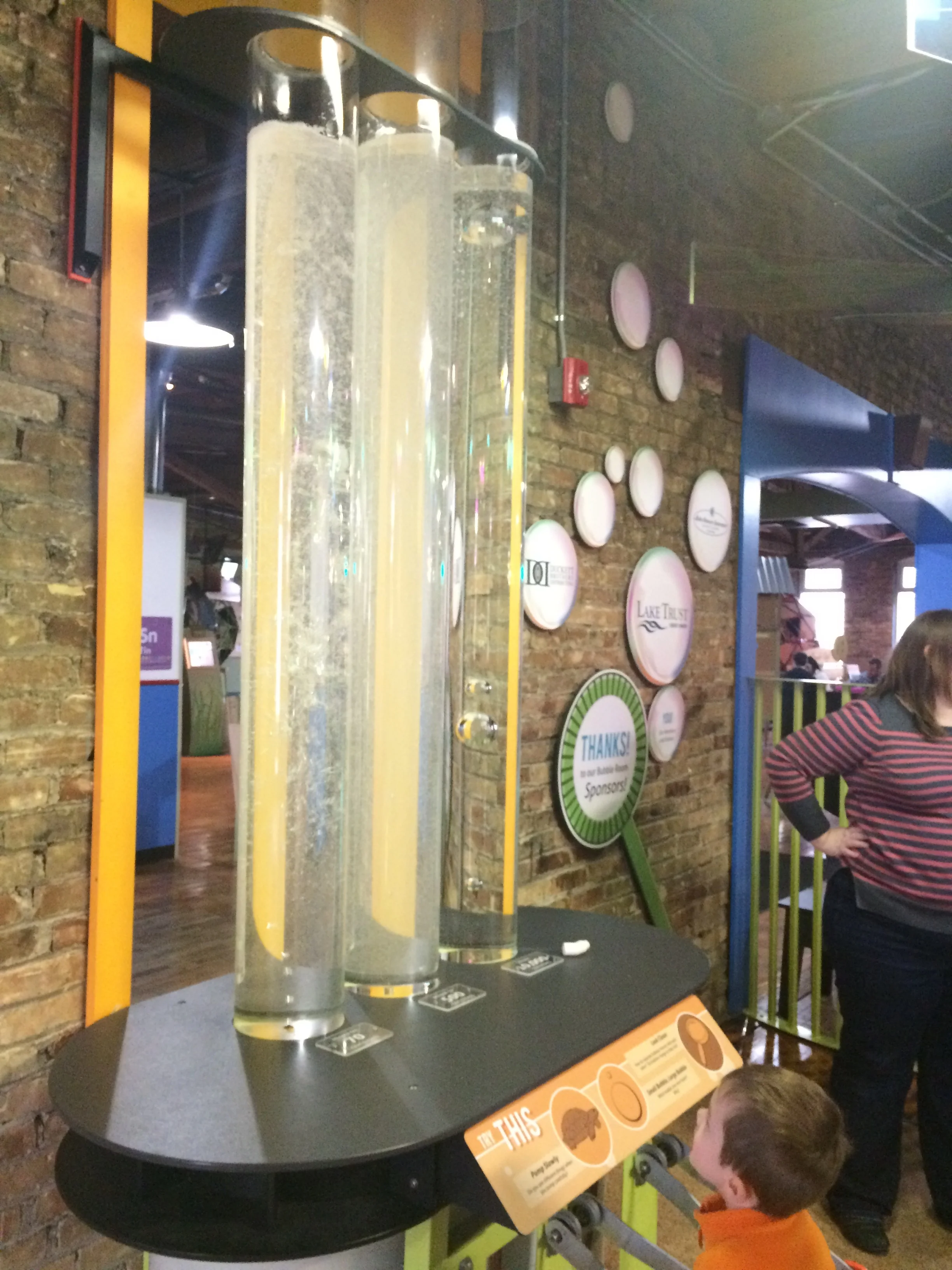
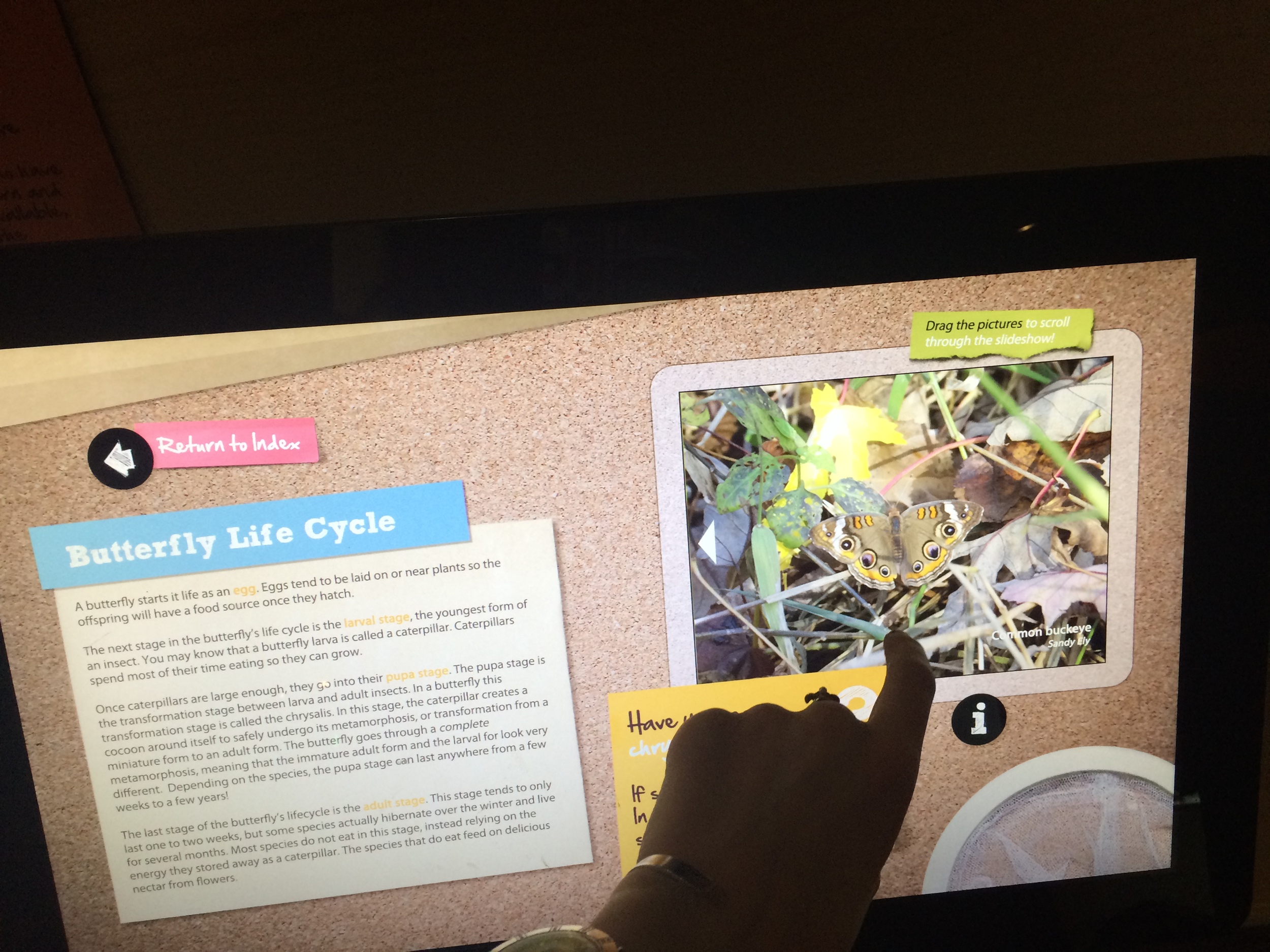
I worked my way through the whole museum, embracing my inner child and exploring what caught my eye. I played with blocks and pipes, blew bubbles and even made a butterfly life cycle out of noodles and colored cotton balls! After some serious play, I took a closer look into the museum's approach to the information architecture. I studied how they presented the information, the detail of the information, and what visual aids, touchpoints or prompts were given to engage the viewer. As well, I studied the interactions of the little guests to see how they responded to the information, did they notice it? Was their experience intuitive? Did they dive in, do it wrong and cycle back to the instructions for help?
I found in most cases, the text was not more than a sentence or two accompanied with many pictures and drawings, suggestions for action, or next steps in activity. As I mentioned before, this tactic was successful because it accurately catered to the viewer. Children are likely not yet skilled readers and most times will not last more than a couples sentences. Not to mention, when there are toys around, children typically blow right past the text and just make up what they are going to do as they go. Knowing this, the museum layout was extremely child-friendly. Low tables, big pictures, bright colors, soft fabrics and floors, workstations where many children could interact at one time, etc.
If I was to rate this museum on it's understanding and execution of UI, I would give it a 9/10. The design team very clearly understood their audience and created an environment of engaged learning that feels like it's all play. The reason Impressions 5 lost the final point, boiled down to two problems: 1. Impossible Expectations: In some of the exhibits, they would have diagrams of shapes or structures to build, but in many cases, the necessary pieces were not available. I spent over 40 minutes in a build site in a huge pile of PVC pipes, so embarrassed I could not build a cube. When I came to the discovery they did not have the corner pieces needed to even create a cube! I was relieved as I felt like a failure, but it made me frustrated for the kids who had to have experienced my same frustration and given up. 2. Exhibit Upkeep: This is closely tied to the first problem, if each of the exhibits were better maintained, the first problem could be avoided altogether. Having the correct pieces to complete the tasks should be a given, the fact I even have to bring it up is a big problem. This only made the museum look unprofessional.
I will have to revisit the museum again to study the information architecture closer once I have settled on a specific exhibit for the focus of my project. At this point, I am very interested in the Bubble Room because I had the most fun playing there, but thinking from a logical standpoint, I want to investigate what new exhibits they have opening and consider focusing my work in that way instead. In a real world experience, a museum would be sending out marketing materials to their members to drum up excitement, so it could be fruitful to simulate that design process.